Survival Analysis

2026-11-17

Python Setup

uv add scikit-survival

Survival Analysis

Survival Analysis is a set of tools to analyze time-to-event data. This leads to the survival rate which models the time to percentage of data to observe the event.

  • To determine the time until a percentile of the data achieves an event
  • Determine which factors may affect the survival rate

Channel Island Birds

  • We are interested in how long do bird eggs hatch since being laid

  • Determine the hatch rate for each species

  • What happens when there is missing data?

How do we determine the survival rate?

  • Measure from first recording to event of interest

  • Construct a probability of surviving up to a certain time point

Data Type

  • Data is typically recorded as time-to-event data

  • For biomedical studies, researchers are interested in time from diagnosis to death, known as time-to-death

Survival Functions

  • Survival Functions

  • Censoring

  • Survival Fuction

  • Log-Rank Test

  • Cox Proportional Hazards Regression

Survival Analysis Functions

The survival analysis functions are a set of models used to model time-to-event data.

Survival Function

The survival function models the probability of observing the event after a certain time point.

\[ S(t) = 1 - F(t) = \int^\infty_t f(x) dx \]

Hazard Function

The hazard function is the probability of observing an event in the next moment, given you survived thus far.

\[ h(t) = \lim_{\Delta \rightarrow 0}\frac{P(t < X < t+\Delta|X = t)}{\Delta} \] ## Cumulative Hazard Function

The cumulative hazard function demonstrate how much hazard is accumulated after a certain amount of time.

\[ H(t) = \int^t_0 h(x) dx \]

Survival Functions

All the survival functions are mathematically equivalent to each other.

Censoring

  • Survival Functions

  • Censoring

  • Survival Fuction

  • Log-Rank Test

  • Cox Proportional Hazards Regression

Censoring

  • Censoring is a mechanism where we do not observe the true time-to-event

  • Not all the time is observed

  • Three common types of censoring mechanisms: Right, Left, and Interval

CI Birds Example

You design a study where you want to record the time it takes for an egg to hatch for different species of birds.

You spend a week monitoring different bird nests and record times when eggs are laid.

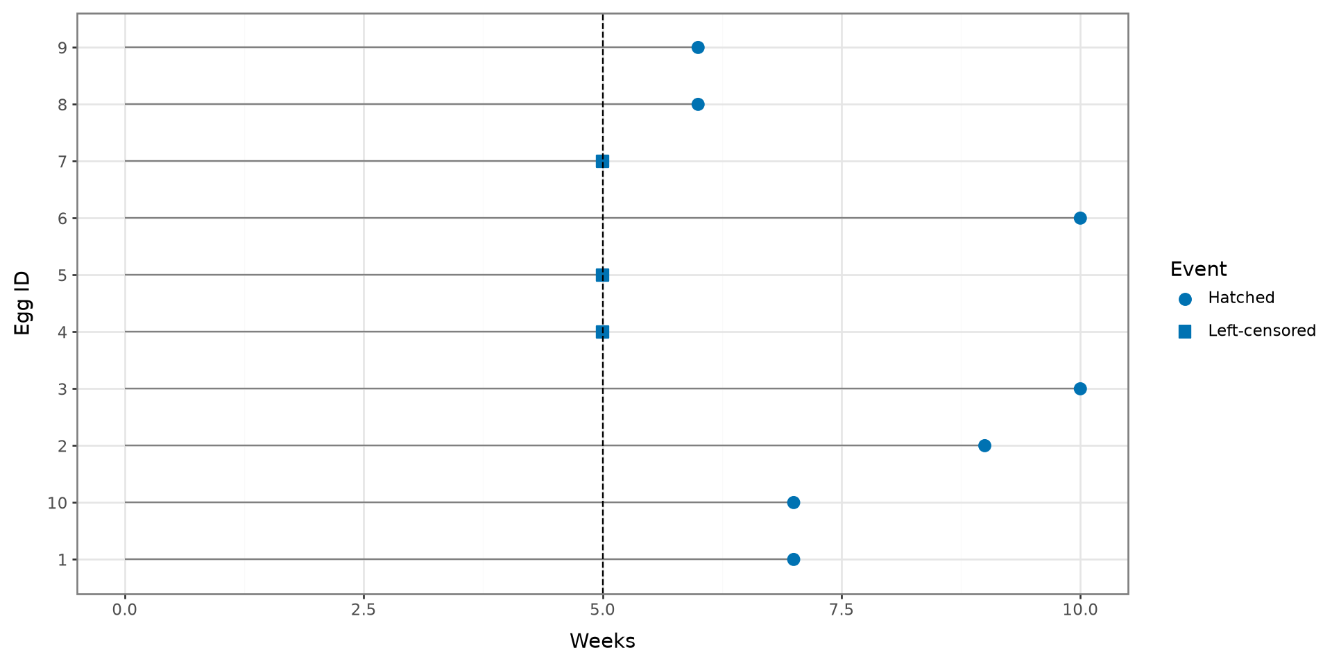
CI Birds Left Censoring

The day before the eggs hatched, your boat broke down and were not able to go to the islands for a week due to repairs.

During this time, 5 eggs hatched!

Left Censoring

dat = pd.DataFrame({
    "ID": [str(value) for value in range(1, 11)],
    "time": [7, 9, 10, 5, 5, 10, 5, 6, 6, 7],
    "event_observed": [True, True, True, False, False,
                       True, False, True, True, True]
})

dat["event"] = np.where(
    dat["event_observed"], "Hatched", "Left-censored"
)

(
    ggplot(dat, aes(x="time", y="ID"))
    + geom_segment(aes(x=0, xend="time", yend="ID"), color="gray")
    + geom_point(aes(shape="event"), size=3, color="#0072B2")
    + geom_vline(xintercept=5, linetype="dashed")
    + scale_shape_manual(values={"Hatched": "o", "Left-censored": "s"})
    + labs(x="Weeks", y="Egg ID", shape="Event")
    + theme_bw()
)

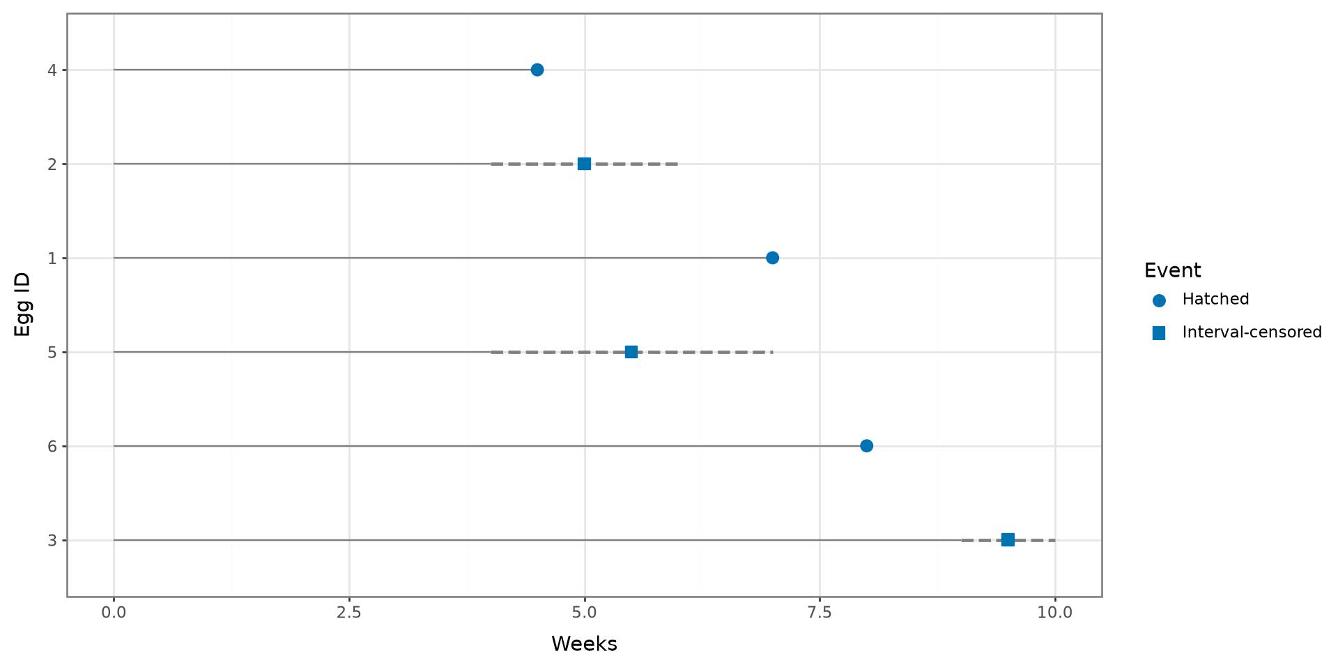
CI Birds Interval Censoring

As you been going out to the islands each day to record whether eggs have hatched or not, you can’t travel to the islands for the next few days due to stormy weather.

During this time, 8 eggs hatched!

Interval Censoring

dat = pd.DataFrame({
    "ID": range(1, 7),
    "lower_time": [7, 4, 9, 4.5, 4, 8],
    "upper_time": [7, 6, 10, 4.5, 7, 8],
    "interval_censored": [False, True, True, False, True, False]
}).sort_values("upper_time", ascending=False).reset_index(drop=True)

dat["ID"] = pd.Categorical(
    dat["ID"].astype(str),
    categories=dat["ID"].astype(str),
    ordered=True
)
dat["event"] = np.where(
    dat["interval_censored"], "Interval-censored", "Hatched"
)
dat["plot_time"] = np.where(
    dat["interval_censored"],
    (dat["lower_time"] + dat["upper_time"]) / 2,
    dat["upper_time"]
)

interval_data = dat[dat["interval_censored"]]

(
    ggplot(dat, aes(y="ID"))
    + geom_segment(aes(x=0, xend="lower_time", yend="ID"), color="gray")
    + geom_segment(
        data=interval_data,
        mapping=aes(x="lower_time", xend="upper_time", y="ID", yend="ID"),
        inherit_aes=False,
        color="gray",
        linetype="dashed",
        size=1
    )
    + geom_point(aes(x="plot_time", shape="event"), size=3, color="#0072B2")
    + scale_shape_manual(values={"Hatched": "o", "Interval-censored": "s"})
    + labs(x="Weeks", y="Egg ID", shape="Event")
    + theme_bw()
)

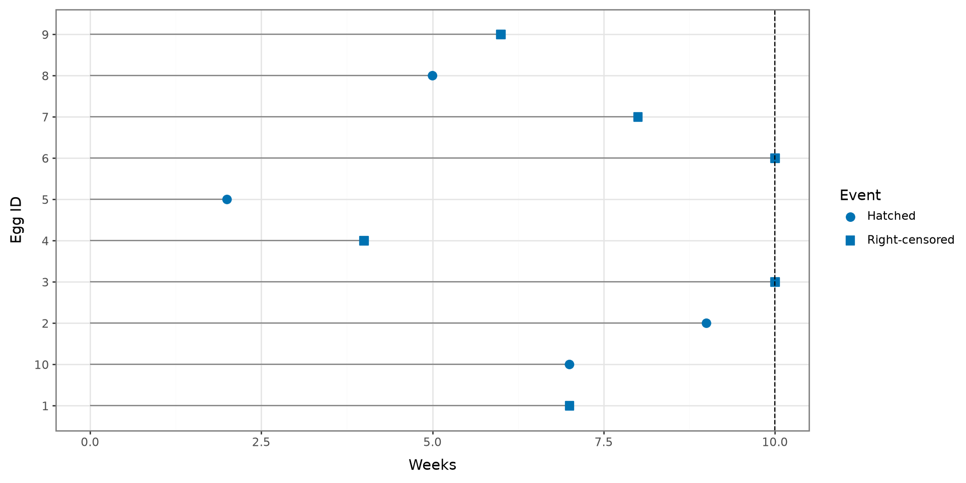
CI Birds Right Censoring

It is the end of the study, and their are 5 more eggs that have not hatched yet!

Additionally, a colleague has informed you that some eggs were eaten by reptiles through out the study. They obtained the day they were eaten or lost.

Right Censoring

dat = pd.DataFrame({
    "ID": [str(value) for value in range(1, 11)],
    "time": [7, 9, 10, 4, 2, 10, 8, 5, 6, 7],
    "event_observed": [False, True, False, False, True,
                       False, False, True, False, True]
})

dat["event"] = np.where(
    dat["event_observed"], "Hatched", "Right-censored"
)

(
    ggplot(dat, aes(x="time", y="ID"))
    + geom_segment(aes(x=0, xend="time", yend="ID"), color="gray")
    + geom_point(aes(shape="event"), size=3, color="#0072B2")
    + geom_vline(xintercept=10, linetype="dashed")
    + scale_shape_manual(values={"Hatched": "o", "Right-censored": "s"})
    + labs(x="Weeks", y="Egg ID", shape="Event")
    + theme_bw()
)

Censoring

  • Censoring affects the time-to-event information

  • However, we obtain some information when data is censored

  • Incorporate methods to utilize partial information

  • Censoring is independent of time-to-event generation

Survival Fuction

  • Survival Functions

  • Censoring

  • Survival Fuction

  • Log-Rank Test

  • Cox Proportional Hazards Regression

Survival Function

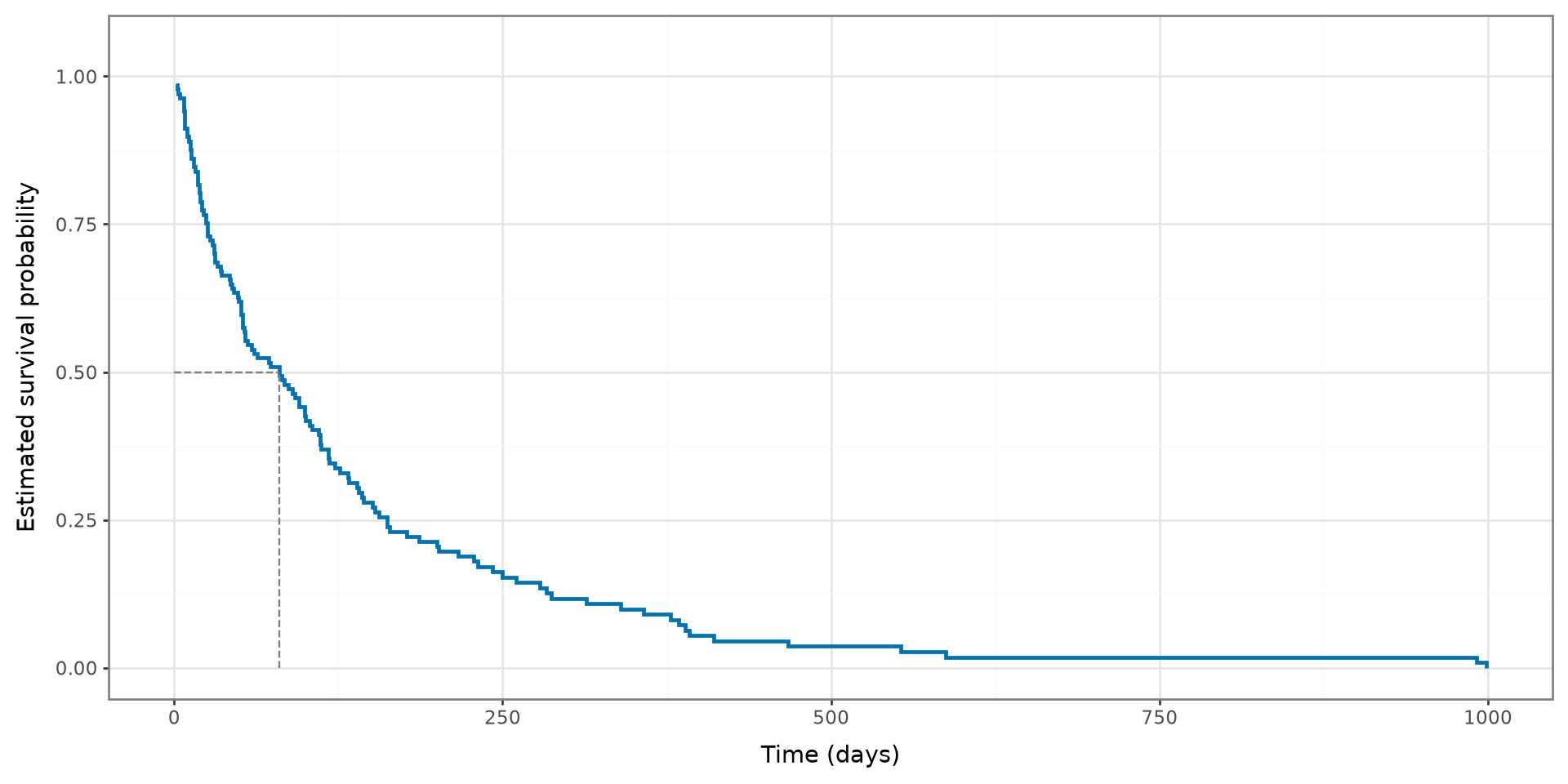
  • The survival curve will determine what is the probability of surviving up to a certain time

  • A survival curve accounts for both censored and uncensored data

  • A survival curve can be used to determine the median survival time of a disease

    • Or the time for at least half of the eggs to hatch

Data Notation

Let \(\{t_j,d_j,R_j\}^D_{j=1}\) denote the survival data, where \(t_1<t_2<\cdots<t_D\) are the ordered distinct observed event times, \(d_j\) represents the number of events at time point \(t_j\), and \(R_j\) denotes the number of subjects still at risk of experiencing the event at \(t_j\).

Kaplan-Meier Estimator

\[ \hat{S}(t) =\left\{\begin{array}{cc} 1 & t=0 \\ \prod_{i:t_j \le t} \left( 1 - \frac{d_j}{R_j} \right) & t_j < t \end{array}\right. \]

Standard Error

\[ \widehat{SE}\{\hat S(t)\}=\sqrt{\hat S^2(t)\sum_{t_j\leq t}\frac{d_j}{R_j(R_j-d_j)}}. \]

Survival Curve

time, survival_probability = kaplan_meier_estimator(
    y["Status"],
    y["Survival_in_days"]
)

median_time = time[np.flatnonzero(survival_probability <= 0.5)[0]]
km_data = pd.DataFrame({
    "time": time,
    "survival_probability": survival_probability
})

(
    ggplot(km_data, aes(x="time", y="survival_probability"))
    + geom_step(color="#0072B2", size=1)
    + annotate(
        "segment", x=0, xend=median_time, y=0.5, yend=0.5,
        color="gray", linetype="dashed"
    )
    + annotate(
        "segment", x=median_time, xend=median_time, y=0, yend=0.5,
        color="gray", linetype="dashed"
    )
    + coord_cartesian(ylim=(0, 1.05))
    + labs(x="Time (days)", y="Estimated survival probability")
    + theme_bw()
)

VA Lung Example

We will use the Veterans’ Administration Lung Cancer Trial data included with scikit-survival. The event of interest is death, and Treatment identifies the treatment group.

Treatment Survival_in_days Status
0 standard 72.0 True
1 standard 411.0 True
2 standard 228.0 True
3 standard 126.0 True
4 standard 118.0 True
veterans[["Treatment", "Survival_in_days", "Status"]].head()

Kaplan–Meier Template

The scikit-survival package contains the necessary functions to estimate a survival curve:

  • Surv: Creates a structured survival outcome
  • kaplan_meier_estimator: Estimates the survival function
1event = data["event"].astype(bool)
2outcome = Surv.from_arrays(event=event, time=data["time"])
3time, survival_probability = kaplan_meier_estimator(
    outcome["event"],
    outcome["time"]
)
1
event must be Boolean: True means the event occurred.
2
Creates a survival outcome containing the censoring mechanism and time to event.
3
The function returns the event times and estimated survival probabilities.

Plotting the Survival Function

scikit-survival calculates the curve, and plotnine displays it:

  • kaplan_meier_estimator: Returns event times and survival probabilities

  • geom_step: Draws the Kaplan–Meier step function

  • geom_ribbon: Draws pointwise confidence intervals

time, survival_probability, confidence_interval = kaplan_meier_estimator(
    outcome["event"],
    outcome["time"],
    conf_type="log-log"
)

median_time = time[np.flatnonzero(survival_probability <= 0.5)[0]]

km_data = pd.DataFrame({
    "time": time,
    "survival_probability": survival_probability,
    "lower": confidence_interval[0],
    "upper": confidence_interval[1]
})

(
    ggplot(km_data, aes(x="time", y="survival_probability"))
    + geom_ribbon(aes(ymin="lower", ymax="upper"), alpha=0.25)
    + geom_step(size=1)
    + geom_hline(yintercept=0.5, linetype="dashed", color="gray")
    + coord_cartesian(ylim=(0, 1.05))
    + labs(x="Time", y="Estimated survival probability")
    + theme_bw()
)

Fitting Curve By Groups

To compare groups, subset the outcome for each group and estimate a separate Kaplan–Meier curve.

curves = []

for group_name in data["group"].unique():
    mask = (data["group"] == group_name).to_numpy()
    time, survival_probability = kaplan_meier_estimator(
        outcome["event"][mask],
        outcome["time"][mask]
    )
    curves.append(pd.DataFrame({
        "time": time,
        "survival_probability": survival_probability,
        "group": group_name
    }))

grouped_km_data = pd.concat(curves, ignore_index=True)

(
    ggplot(
        grouped_km_data,
        aes(x="time", y="survival_probability", color="group")
    )
    + geom_step(size=1)
    + coord_cartesian(ylim=(0, 1.05))
    + labs(x="Time", y="Estimated survival probability", color="Group")
    + theme_bw()
)

Combine each group’s returned survival probabilities into one data frame and map the group variable to color in plotnine.

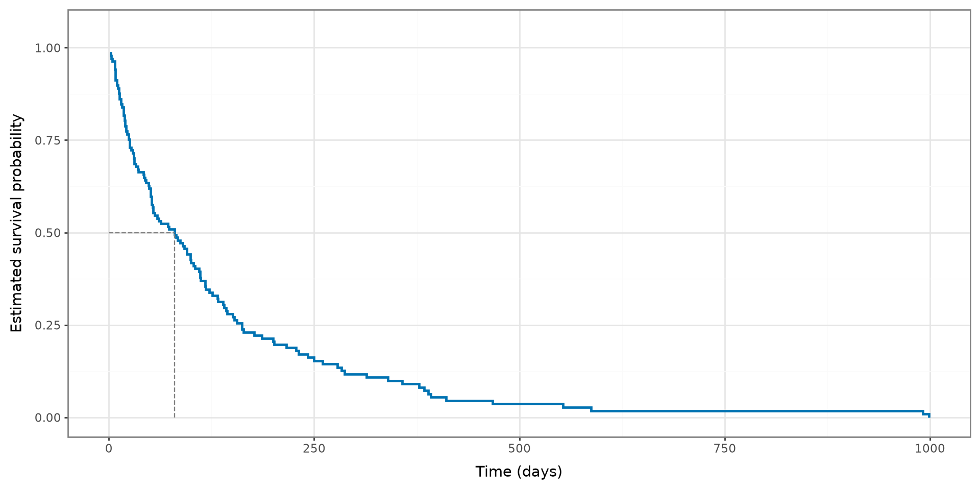
Veterans’ Survival Curve

  • Fit a survival curve using load_veterans_lung_cancer.
  • Survival_in_days: time-to-death or censoring
  • Status: event indicator (True means death was observed)
  • Plot the survival curve and add a line indicating the 50th percentile
time, survival_probability = kaplan_meier_estimator(
    y["Status"], y["Survival_in_days"]
)

median_time = time[np.flatnonzero(survival_probability <= 0.5)[0]]
km_data = pd.DataFrame({
    "time": time,
    "survival_probability": survival_probability
})

(
    ggplot(km_data, aes(x="time", y="survival_probability"))
    + geom_step(color="#0072B2", size=1)
    + annotate(
        "segment", x=0, xend=median_time, y=0.5, yend=0.5,
        color="gray", linetype="dashed"
    )
    + annotate(
        "segment", x=median_time, xend=median_time, y=0, yend=0.5,
        color="gray", linetype="dashed"
    )
    + coord_cartesian(ylim=(0, 1.05))
    + labs(x="Time (days)", y="Estimated survival probability")
    + theme_bw()
)

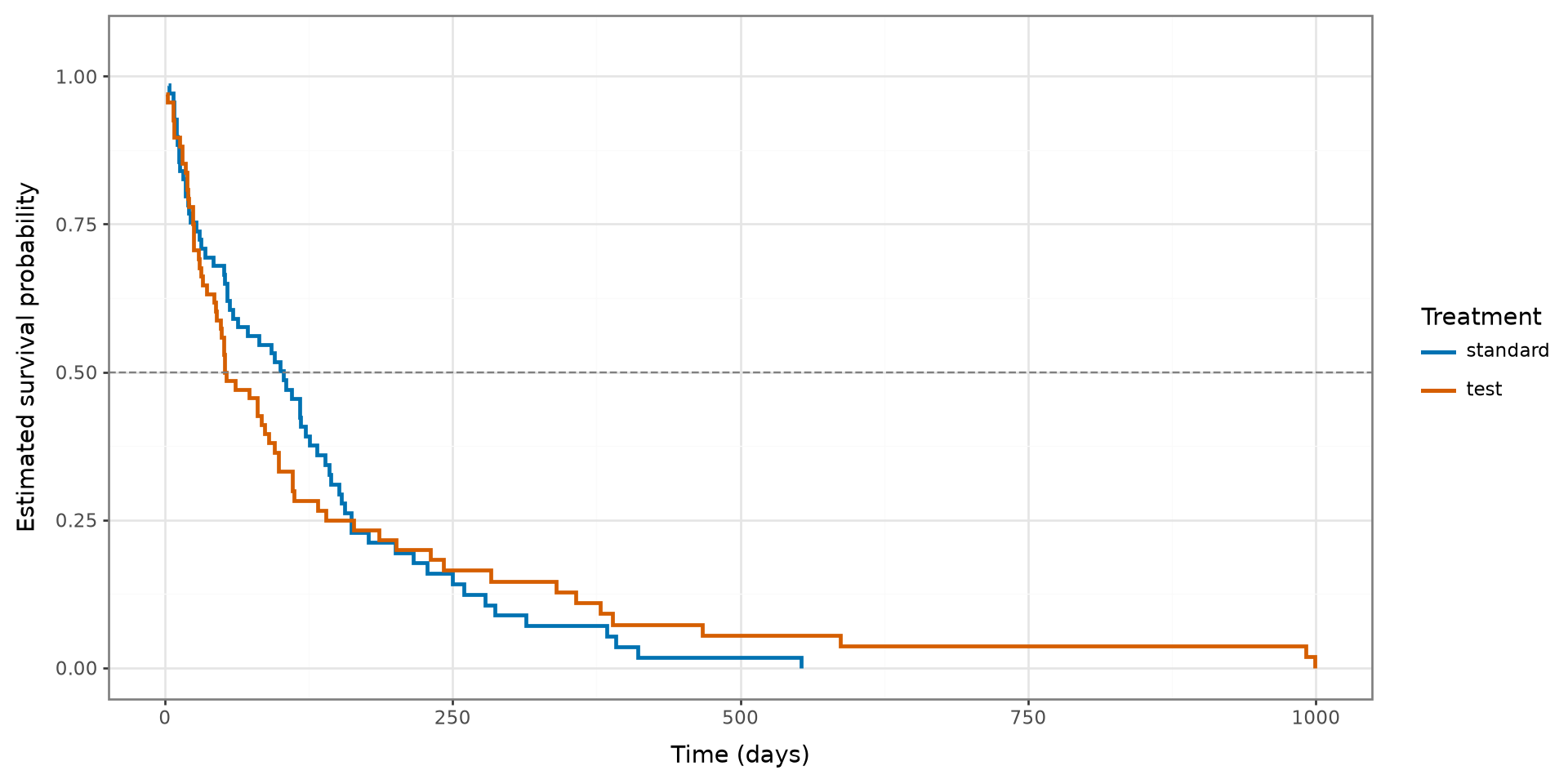
Survival Curve by Treatment

  • Fit survival curves stratified by treatment group.
  • Survival_in_days: time-to-death or censoring
  • Status: event indicator
  • Treatment: treatment group
  • Plot each survival curve and add a line indicating the 50th percentile
curves = []

for treatment in X["Treatment"].unique():
    mask = (X["Treatment"] == treatment).to_numpy()
    time, survival_probability = kaplan_meier_estimator(
        y["Status"][mask],
        y["Survival_in_days"][mask]
    )
    curves.append(pd.DataFrame({
        "time": time,
        "survival_probability": survival_probability,
        "Treatment": str(treatment)
    }))

treatment_km_data = pd.concat(curves, ignore_index=True)

(
    ggplot(
        treatment_km_data,
        aes(x="time", y="survival_probability", color="Treatment")
    )
    + geom_step(size=1)
    + geom_hline(yintercept=0.5, color="gray", linetype="dashed")
    + scale_color_manual(values=["#0072B2", "#D55E00"])
    + coord_cartesian(ylim=(0, 1.05))
    + labs(x="Time (days)", y="Estimated survival probability")
    + theme_bw()
)

Log-Rank Test

  • Survival Functions

  • Censoring

  • Survival Fuction

  • Log-Rank Test

  • Cox Proportional Hazards Regression

Hypothesis Testing

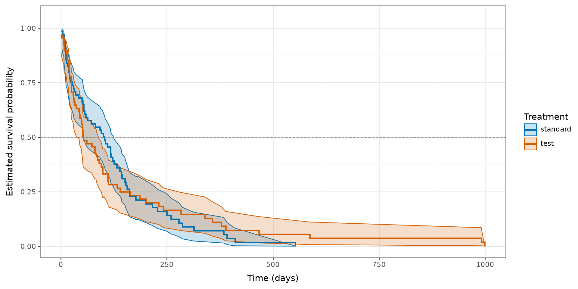
  • The treatment curves may differ because of a real treatment effect or random variation.
  • Confidence intervals show the uncertainty around each estimated curve.
  • A log-rank test can formally compare the survival functions.

Log-Rank Test

The log-rank test compares the entire survival experience of two or more independent groups.

  • \(H_0\): The groups have the same survival function.
  • \(H_A\): At least one group has a different survival function.
  • A small p-value provides evidence against \(H_0\).

Log-Rank Test Template

test_statistic, p_value = compare_survival(
    outcome,
    data["group"]
)

print(f"Chi-square statistic: {test_statistic:.3f}")
print(f"p-value: {p_value:.4f}")

Veterans’ Log-Rank Test

Chi-square statistic: 0.008
p-value: 0.9277
counts observed expected statistic
group
standard 69 64 64.500197 -0.500197
test 68 64 63.499803 0.500197
test_statistic, p_value, group_statistics, covariance = compare_survival(
    y,
    X["Treatment"],
    return_stats=True
)

print(f"Chi-square statistic: {test_statistic:.3f}")
print(f"p-value: {p_value:.4f}")
group_statistics

Survival Curves with Confidence Intervals

Add confidence intervals to the previous plot.
curves = []

for treatment in X["Treatment"].unique():
    mask = (X["Treatment"] == treatment).to_numpy()
    time, survival_probability, confidence_interval = kaplan_meier_estimator(
        y["Status"][mask],
        y["Survival_in_days"][mask],
        conf_type="log-log"
    )
    curves.append(pd.DataFrame({
        "time": time,
        "survival_probability": survival_probability,
        "lower": confidence_interval[0],
        "upper": confidence_interval[1],
        "Treatment": str(treatment)
    }))

treatment_ci_data = pd.concat(curves, ignore_index=True)

(
    ggplot(
        treatment_ci_data,
        aes(
            x="time",
            y="survival_probability",
            color="Treatment",
            group="Treatment"
        )
    )
    + geom_ribbon(aes(ymin="lower", ymax="upper", fill="Treatment"), alpha=0.2)
    + geom_step(size=1)
    + geom_hline(yintercept=0.5, color="gray", linetype="dashed")
    + scale_color_manual(values=["#0072B2", "#D55E00"])
    + scale_fill_manual(values=["#0072B2", "#D55E00"])
    + coord_cartesian(ylim=(0, 1.05))
    + labs(x="Time (days)", y="Estimated survival probability")
    + theme_bw()
)

Cox Proportional Hazards Regression

  • Survival Functions

  • Censoring

  • Survival Fuction

  • Log-Rank Test

  • Cox Proportional Hazards Regression

Why Use Cox Regression?

Kaplan–Meier curves and log-rank tests compare groups one variable at a time. Cox regression estimates how several predictors are associated with the event rate while accounting for censoring.

  • The outcome remains a time and an event indicator.
  • Predictors may be numerical or categorical.
  • The model estimates a coefficient and hazard ratio for each predictor.

Cox Proportional Hazards Model

\[ h(t \mid \mathbf{x}) = h_0(t)\exp\left(\boldsymbol{\beta}^{\mathsf{T}}\mathbf{x}\right) \]

  • \(h_0(t)\) is the baseline hazard function.
  • \(\boldsymbol{\beta}\) contains the estimated regression coefficients.
  • \(\exp(\beta_j)\) is the hazard ratio associated with a one-unit increase in predictor \(x_j\), holding the other predictors constant.

Prepare the Predictor Matrix

CoxPHSurvivalAnalysis requires a numerical predictor matrix. Use OneHotEncoder to convert the categorical variables into indicator columns.

Age_in_years Celltype=large Celltype=smallcell Celltype=squamous Karnofsky_score Months_from_Diagnosis Prior_therapy=yes Treatment=test
0 69.0 0.0 0.0 1.0 60.0 7.0 0.0 0.0
1 64.0 0.0 0.0 1.0 70.0 5.0 1.0 0.0
2 38.0 0.0 0.0 1.0 60.0 3.0 0.0 0.0
3 63.0 0.0 0.0 1.0 60.0 9.0 1.0 0.0
4 65.0 0.0 0.0 1.0 70.0 11.0 1.0 0.0
encoder = OneHotEncoder()
X_encoded = encoder.fit_transform(X)

X_encoded.head()

Fit a Cox Regression Model

CoxPHSurvivalAnalysis()
In a Jupyter environment, please rerun this cell to show the HTML representation or trust the notebook.
On GitHub, the HTML representation is unable to render, please try loading this page with nbviewer.org.
cox_model = CoxPHSurvivalAnalysis()
cox_model.fit(X_encoded, y)

Cox Regression Template

# X contains the predictor variables.
# y is a structured survival outcome.

encoder = OneHotEncoder()
X_encoded = encoder.fit_transform(X)

cox_model = CoxPHSurvivalAnalysis()
cox_model.fit(X_encoded, y)

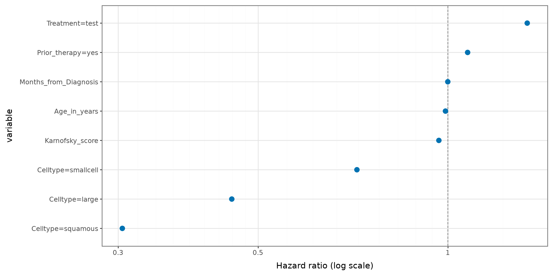
Coefficients and Hazard Ratios

variable coefficient hazard_ratio
3 Celltype=squamous -1.188 0.305
1 Celltype=large -0.789 0.454
2 Celltype=smallcell -0.332 0.718
4 Karnofsky_score -0.033 0.968
0 Age_in_years -0.009 0.991
5 Months_from_Diagnosis -0.000 1.000
6 Prior_therapy=yes 0.072 1.075
7 Treatment=test 0.290 1.336
cox_results = pd.DataFrame({
    "variable": X_encoded.columns,
    "coefficient": cox_model.coef_,
    "hazard_ratio": np.exp(cox_model.coef_)
}).sort_values("hazard_ratio")

cox_results.round(3)

Plot the Hazard Ratios

Interpret a Hazard Ratio

  • Hazard ratio greater than 1: the event rate increases as the predictor increases.
  • Hazard ratio less than 1: the event rate decreases as the predictor increases.
  • Hazard ratio equal to 1: no estimated association with the event rate.
  • For categorical predictors, interpretation is relative to the omitted reference category.

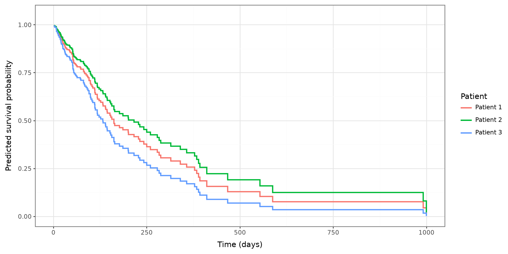
Predicted Survival Curves

survival_functions = cox_model.predict_survival_function(
    X_encoded.iloc[:3]
)

prediction_frames = []

for patient_number, survival_function in enumerate(
    survival_functions,
    start=1
):
    prediction_frames.append(pd.DataFrame({
        "time": survival_function.x,
        "survival_probability": survival_function(survival_function.x),
        "Patient": f"Patient {patient_number}"
    }))

prediction_data = pd.concat(prediction_frames, ignore_index=True)

(
    ggplot(
        prediction_data,
        aes(x="time", y="survival_probability", color="Patient")
    )
    + geom_step(size=1)
    + coord_cartesian(ylim=(0, 1.05))
    + labs(x="Time (days)", y="Predicted survival probability")
    + theme_bw()
)

Concordance Index

The concordance index measures whether patients with higher predicted risk tend to experience the event sooner.

Concordance index: 0.736
  • A value of 0.5 is approximately random ordering.
  • A value of 1 indicates perfect ordering of observed outcomes.
  • Evaluate performance on test data when assessing predictive accuracy.